Appearance
General
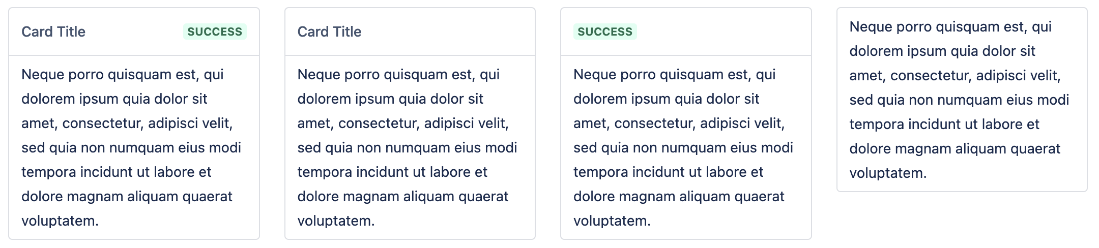
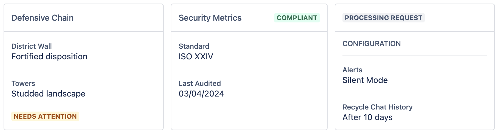
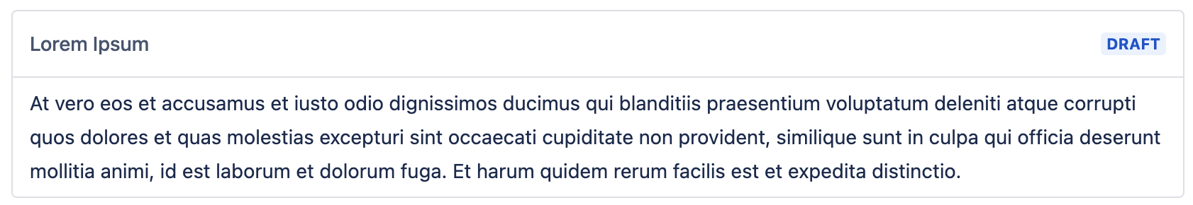
BorderedCard
A standard card component with a border.
Properties
| Property | Type | Allowed Values | Required | Description |
|---|---|---|---|---|
title | String | Any | false | The title of the card, placed in the card header. Optional. |
lozenge | LozengeData | Any | false | A lozenge that will display next to the title in the card header. Optional. |
children | Array | Any | true | The children components to place in the card body. |
type | String | 'BorderedCard' | true | The type label of the component. |
Example
json
{
  "type": "BorderedCard",
  "title": "My Card Title",
  "children": [
    "...components"
  ]
}
Screenshot
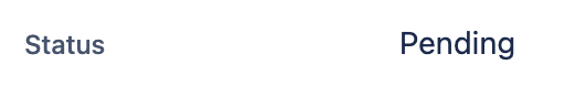
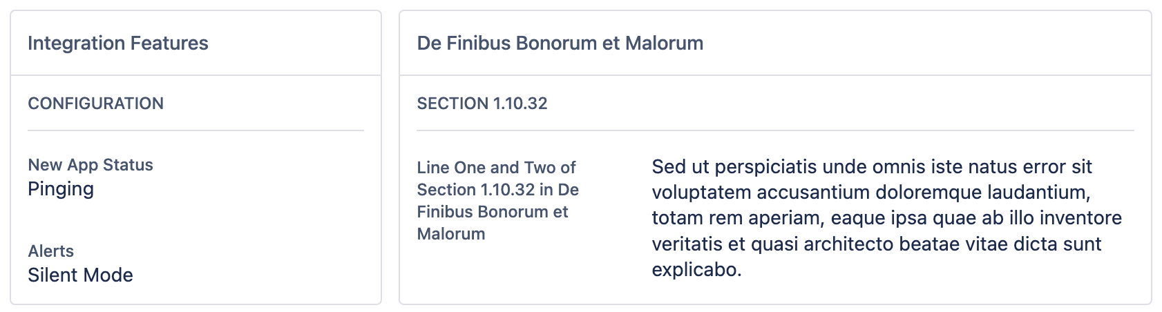
FieldValue
A field value is a key-value pair that can be displayed in a card.
Properties
| Property | Type | Allowed Values | Required | Description |
|---|---|---|---|---|
key | String | Any | true | The key of the field value. |
value | String | Any | false | The value of the field value. |
appearance | String | 'neutral', 'danger', 'information', 'discovery', 'success', 'warning', 'text' | false | The appearance of the field value. Will display "neutral" if not set. |
appearanceMap | Object | Any | false | Specifies the appearance of the lozenge based on its content. e.g { success: ["Good", "Great"] } means that if the content is either "Good" or "Great", the lozenge will have the success appearance applied. |
type | String | 'FieldValue' | true | The type label of the component. |
Example
json
{
  "type": "FieldValue",
  "key": "Name",
  "value": "John Doe",
  "appearance": "success"
}
Screenshot
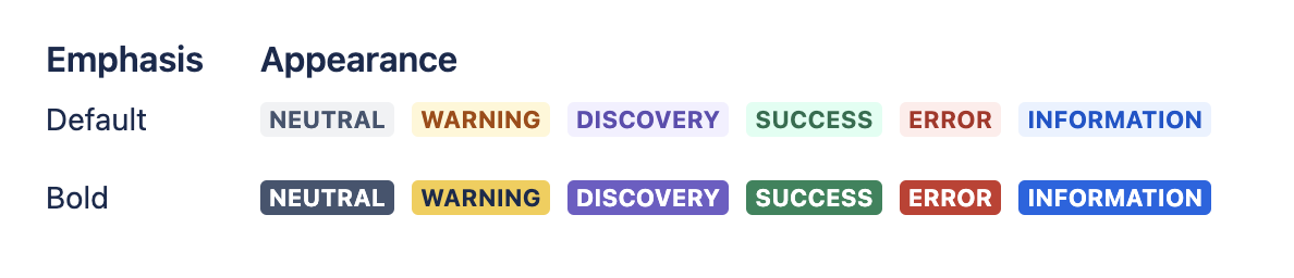
Lozenge
A coloured capsule used to indicate status or change with visual emphasis.
Properties
| Property | Type | Allowed Values | Required | Description |
|---|---|---|---|---|
content | String | Any | true | The text content of the lozenge. |
appearance | String | 'neutral', 'danger', 'information', 'discovery', 'success', 'warning' | false | The appearance of the lozenge. Will display "neutral" if not set. |
emphasis | String | 'bold', 'default' | false | The emphasis of the lozenge. Will display "default" if not set. |
appearanceMap | Object | Any | false | Specifies the appearance of the lozenge based on its content. e.g { success: ["Good", "Great"] } means that if the content is either "Good" or "Great", the lozenge will have the success appearance applied. |
link | String | Any | false | The URL to navigate to when the lozenge is clicked. |
type | String | 'Lozenge' | true | The type label of the component. |
Example
json
{
  "type": "Lozenge",
  "content": "A success lozenge",
  "appearance": "success",
  "emphasis": "bold",
  "link": "https://product-forge.dev"
}
Screenshot
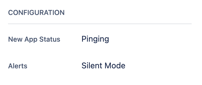
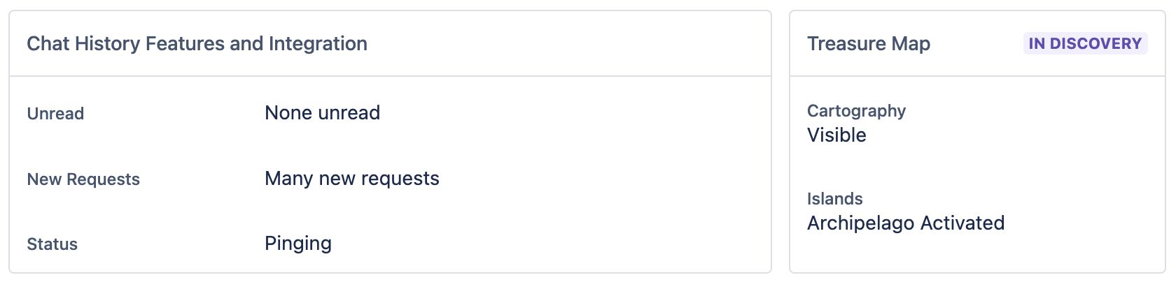
StackedInformationGroup
A card that contains a title and a list of field values. Similar to what is shown on the right-side of a Jira issue.
Properties
| Property | Type | Allowed Values | Required | Description |
|---|---|---|---|---|
title | String | Any | true | The title of the group, displayed in the card header. |
children | Array | FieldValue | true | The field values to display. |
type | String | 'StackedInformationGroup' | true | The type label of the component. |
Example
json
{
  "type": "StackedInformationGroup",
  "title": "My Stacked Info Group",
  "children": [
    "...fieldValues"
  ]
}
Screenshot
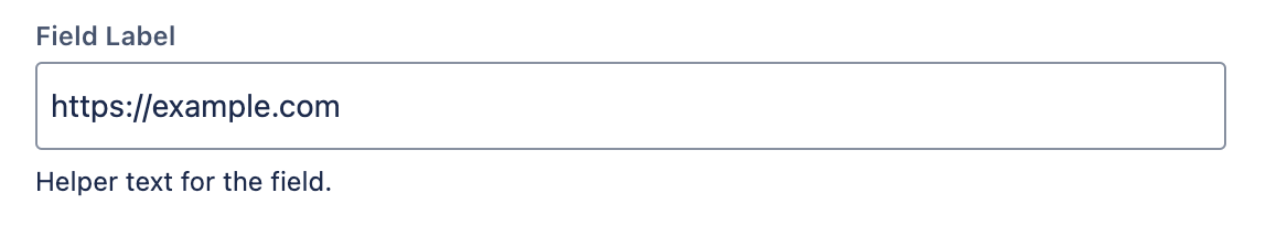
FormTextField
A basic input type field used to display a piece of information that you want the user to be able to easily copy.
Properties
| Property | Type | Allowed Values | Required | Description |
|---|---|---|---|---|
label | String | Any | true | The label of the input field. |
value | String | Any | true | The value placed inside the input field. |
helper | String | Any | true | Helper text to display for the field. |
readonly | Boolean | Any | true | Controls if the input field is readonly. |
type | String | 'FormTextField' | true | The type label of the component. |
Example
json
{
  "type": "FormTextField",
  "label": "Update UI URL",
  "value": "https://example.com",
  "helper": "Click to copy content to clipboard.",
  "readonly": true
}
Screenshot
Typography
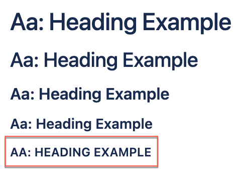
HeadingLarge
A title component meant for the top of a page.
Properties
| Property | Type | Allowed Values | Required | Description |
|---|---|---|---|---|
content | String | Any | true | The title of the page. |
type | String | 'HeadingLarge' | true | The type label of the component. |
Example
json
{
  "type": "HeadingLarge",
  "content": "My Page Title"
}
Screenshot
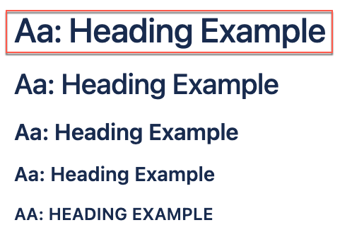
HeadingMedium
A title component meant for the top of a page.
Properties
| Property | Type | Allowed Values | Required | Description |
|---|---|---|---|---|
content | String | Any | true | The title of the page. |
type | String | 'HeadingMedium' | true | The type label of the component. |
Example
json
{
  "type": "HeadingMedium",
  "content": "My Page Title"
}
Screenshot
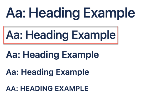
HeadingSmall
A title component meant for the top of a page.
Properties
| Property | Type | Allowed Values | Required | Description |
|---|---|---|---|---|
content | String | Any | true | The title of the page. |
type | String | 'HeadingSmall' | true | The type label of the component. |
Example
json
{
  "type": "HeadingSmall",
  "content": "My Page Title"
}
Screenshot
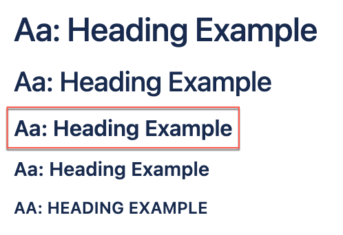
HeadingXSmall
A title component meant for the top of a page.
Properties
| Property | Type | Allowed Values | Required | Description |
|---|---|---|---|---|
content | String | Any | true | The title of the page. |
type | String | 'HeadingXSmall' | true | The type label of the component. |
Example
json
{
  "type": "HeadingXSmall",
  "content": "My Page Title"
}
Screenshot
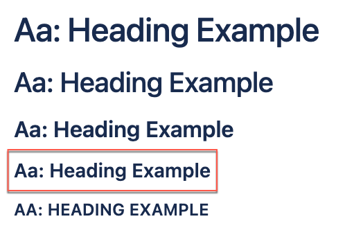
HeadingXXSmall
The header text for a UI section.
Properties
| Property | Type | Allowed Values | Required | Description |
|---|---|---|---|---|
content | String | Any | true | The title of the section. |
type | String | 'HeadingXXSmall' | true | The type label of the component. |
Example
json
{
  "type": "HeadingXXSmall",
  "content": "Section Title"
}
Screenshot
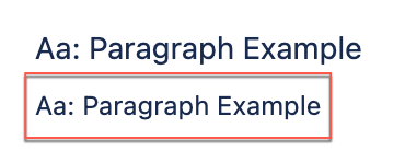
ParagraphMedium
A paragraph of text in medium size.
Properties
| Property | Type | Allowed Values | Required | Description |
|---|---|---|---|---|
content | String | Any | true | The text content of the paragraph. |
type | String | 'ParagraphMedium' | true | The type label of the component. |
Example
json
{
  "type": "ParagraphMedium",
  "content": "This is a paragraph of medium size."
}
Screenshot
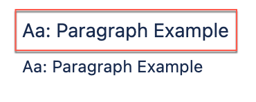
ParagraphSmall
A paragraph of text in small size.
Properties
| Property | Type | Allowed Values | Required | Description |
|---|---|---|---|---|
content | String | Any | true | The text content of the paragraph. |
type | String | 'ParagraphSmall' | true | The type label of the component. |
Example
json
{
  "type": "ParagraphSmall",
  "content": "This is a paragraph of small size."
}
Screenshot
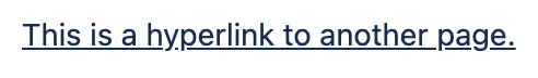
HyperlinkMedium
A simple link to another URL.
Properties
| Property | Type | Allowed Values | Required | Description |
|---|---|---|---|---|
content | String | Any | true | The text content of the paragraph. |
link | String | Any | true | The URL to navigate to. |
openNewTab | Boolean | Any | true | Whether to open the URL in a new tab. |
type | String | 'HyperlinkMedium' | true | The type label of the component. |
Example
json
{
  "type": "HyperlinkMedium",
  "content": "This is a hyperlink.",
  "link": "https://product-forge.dev",
  "openNewTab": true
}
Screenshot
Layouts
EqualThirdsLayout
A layout with three equal-width columns of children.
Properties
| Property | Type | Allowed Values | Required | Description |
|---|---|---|---|---|
childrenA | Array | Any | true | The first list of children components. |
childrenB | Array | Any | true | The second list of children components. |
childrenC | Array | Any | true | The third list of children components. |
type | String | 'EqualThirdsLayout' | true | The type label of the component. |
Example
json
{
  "type": "EqualThirdsLayout",
  "childrenA": [
    "...components"
  ],
  "childrenB": [
    "...components"
  ],
  "childrenC": [
    "...components"
  ]
}
Screenshot
FullWidthLayout
A layout with a single full-width column of children.
Properties
| Property | Type | Allowed Values | Required | Description |
|---|---|---|---|---|
children | Array | Any | true | The list of children components. |
type | String | 'FullWidthLayout' | true | The type label of the component. |
Example
json
{
  "type": "FullWidthLayout",
  "children": [
    "...components"
  ]
}
Screenshot
OnePlusTwoLayout
A layout with two columns of children in a 1:2 width ratio.
Properties
| Property | Type | Allowed Values | Required | Description |
|---|---|---|---|---|
childrenA | Array | Any | true | The first list of children components. |
childrenB | Array | Any | true | The second list of children components. |
type | String | 'OnePlusTwoLayout' | true | The type label of the component. |
Example
json
{
  "type": "OnePlusTwoLayout",
  "childrenA": [
    "...components"
  ],
  "childrenB": [
    "...components"
  ]
}
Screenshot
TwoPlusOneLayout
A layout with two columns of children in a 2:1 width ratio.
Properties
| Property | Type | Allowed Values | Required | Description |
|---|---|---|---|---|
childrenA | Array | Any | true | The first list of children components. |
childrenB | Array | Any | true | The second list of children components. |
type | String | 'TwoPlusOneLayout' | true | The type label of the component. |
Example
json
{
  "type": "TwoPlusOneLayout",
  "childrenA": [
    "...components"
  ],
  "childrenB": [
    "...components"
  ]
}
Screenshot
Sections
FullPageSection
A full page section with a title and children.
Properties
| Property | Type | Allowed Values | Required | Description |
|---|---|---|---|---|
title | String | Any | true | The title of the section. |
children | Array | Any | true | The children layout components to place in the section body. |
type | String | 'FullPageSection' | true | The type label of the component. |
Example
json
{
  "type": "FullPageSection",
  "title": "Section Title",
  "children": [
    "...layoutComponents"
  ]
}
Views
TabPanel
Tab panels are the top-level containers for modules that are displayed in tabs.
Properties
| Property | Type | Allowed Values | Required | Description |
|---|---|---|---|---|
tabTitle | String | Any | true | The text to put into the tab button. |
children | Array | Any | true | The children components to place in the tab body. Must have Layout or Section components at the top level. |
type | String | 'TabPanel' | true | The type label of the component. |
Example
json
{
  "type": "TabPanel",
  "tabTitle": "Tab Title",
  "children": [
    "...layoutAndSectionComponents"
  ]
}
Table
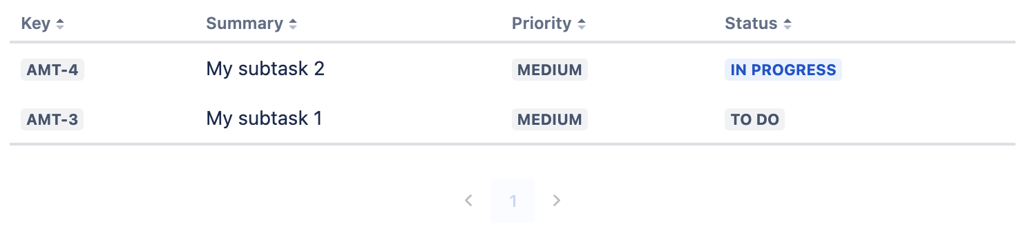
DynamicTable
A flexible table component that can be used to display data in a table structure.
Properties
| Property | Type | Allowed Values | Required | Description |
|---|---|---|---|---|
columnHeaders | Array | TableHeader | true | The headers of the table |
tableRows | undefined | Any | true | The data to be displayed in the table. Must be a JSON list of identically shaped objects. Specify paths to the values from each object you want to display in the columnHeaders. |
type | String | 'DynamicTable' | true | The type label of the component. |
Example
json
{
  "type": "DynamicTable",
  "columnHeaders": [
    "...columnHeaders"
  ],
  "tableRows": [
    "...tableRows"
  ]
}
Screenshot
TableHeader
Used to tell App Maker what content to show in each column of a Dynamic Table.
Properties
| Property | Type | Allowed Values | Required | Description |
|---|---|---|---|---|
title | String | Any | true | The title of the column. |
valuePath | String | Any | true | The path to the field in the row that should be displayed in this column. e.g "row.my-value". |
linkPath | String | Any | false | The path to the field in the row that should be used as the link this column points to. e.g "row.my-link". |
fieldType | String | 'text', 'lozenge', 'emitter-button' | false | The type of field the column represents. |
appearanceMap | Object | Any | false | Specifies the appearance of the field based on its value, only applicable for fieldType lozenge. e.g { success: ["Good", "Great"] } means that if the field contains the value "Good" or "Great", the lozenge will have the success appearance applied. |
type | String | 'TableHeader' | true | The type label of the component. |
Example
json
{
  "type": "TableHeader",
  "title": "My Value",
  "valuePath": "row.my-value",
  "linkPath": "row.my-link",
  "fieldType": "lozenge",
  "appearanceMap": {
    "success": [
      "Good",
      "Great"
    ]
  }
}