Appearance
Dynamic Tables
Tables allow you to display a list of data in an easy-to-read format. This is useful when you have a list of items that relate to something like a Jira issue, and you want to display them in a way that is easy to read and understand.
App Maker provides a DynamicTable component that allows you to easily display data in a range of different structures and ways, hence the name "DynamicTable".
Dynamic Table UI Component
High-level Structure
- Tables are made of two main components; Columns and Rows.
- Columns: Each column in a table displays the same type of data, and is meant to represent a single field or property within a list of standardised data objects.
- Columns in a table are defined in a
columnHeadersproperty, which is a list ofTableHeaderobjects.
- Columns in a table are defined in a
- Rows: Each row in a table represents a single data object, and is meant to display all the fields or properties of that object that you want to show to users.
- The rows in a table are represented in a
tableRowsproperty, which is a list of objects of any shape.
- The rows in a table are represented in a
- Columns: Each column in a table displays the same type of data, and is meant to represent a single field or property within a list of standardised data objects.
columnHeaders
- The
TableHeaderobject is used to define the structure of a column in a table. - It has several properties that you set to define how the column should look and behave.
title: The title of the column, displayed at the top of the column.valuePath: The path to the field or property in the data object in each row that you want to display in the UI.linkPath(optional): The path to the field or property in the data object in each row that you want to use as a link.- This allows users to click on a cell in the table and be taken to a new page.
fieldType(optional - defaults to "text"): The way you want the data in the column to be displayed.- This can be simple "text", or a
"Lozenge".
- This can be simple "text", or a
appearanceMap(optional - only if fieldType is"Lozenge"): An object that allows you to apply conditional styling to the cells in the column.- The
appearanceMapobject has keys for each of the"Lozenge"appearances you want to use. - For each key, you provide an array of values that should be displayed in that appearance.
- e.g.
appearanceMap: { success: ['Good', 'Great'] }would display any cell with the value "Good" or "Great" with the "success" appearance.
- The
Example:
json
{
  "type": "TableHeader",
  "title": "My Value",
  "valuePath": "row.my_value",
  "linkPath": "row.my_link",
  "fieldType": "lozenge",
  "appearanceMap": { "success": ["Good", "Great"] }
}
tableRows
- The
tableRowsproperty is a list of objects that represent the data you want to display in the table. - Each object in this array represents a single row in the table.
- You will often want to combine this functionality with a Template Function for use-cases like:
- Populating the items from a Data List into a table so that each item forms one row.
- Populating the child issues or linked issues of the Issue the user is currently viewing into a table as rows.
- The structure of these objects should match up with the
valuePathandlinkPathproperties defined in yourcolumnHeaders.
Example:
json
[
  {
    "row": {
      "my_value": "Good",
      "my_link": "https://example.com/1"
    }
  },
  {
    "row": {
      "my_value": "Great",
      "my_link": "https://example.com/2"
    }
  }
]
Using the DynamicTable Component
To use the DynamicTable component in your App Maker application, you need to provide both the columnHeaders and tableRows properties.
Example Dynamic Table
json
{
  "action": "set",
  "resourceType": "site",
  "module": "jira:projectPage",
  "title": "my-component",
  "componentData": {
    "type": "TabPanel",
    "tabTitle": "Placeholder Tab",
    "children": [
      {
        "type": "DynamicTable",
        "columnHeaders": [
          {
            "type": "TableHeader",
            "title": "Status",
            "valuePath": "row.status",
            "fieldType": "lozenge",
            "appearanceMap": {
              "success": [
                "Complete",
                "Resolved"
              ],
              "warning": [
                "In Progress"
              ],
              "error": [
                "Blocked",
                "Failed"
              ]
            }
          },
          {
            "type": "TableHeader",
            "title": "Issue Key",
            "valuePath": "row.key",
            "linkPath": "row.url"
          },
          {
            "type": "TableHeader",
            "title": "Summary",
            "valuePath": "row.summary"
          }
        ],
        "tableRows": [
          {
            "row": {
              "status": "In Progress",
              "key": "PROJ-123",
              "url": "https://jira.example.com/browse/PROJ-123",
              "summary": "Implement new feature"
            }
          },
          {
            "row": {
              "status": "Complete",
              "key": "PROJ-124",
              "url": "https://jira.example.com/browse/PROJ-124",
              "summary": "Fix critical bug"
            }
          }
        ]
      }
    ]
  }
}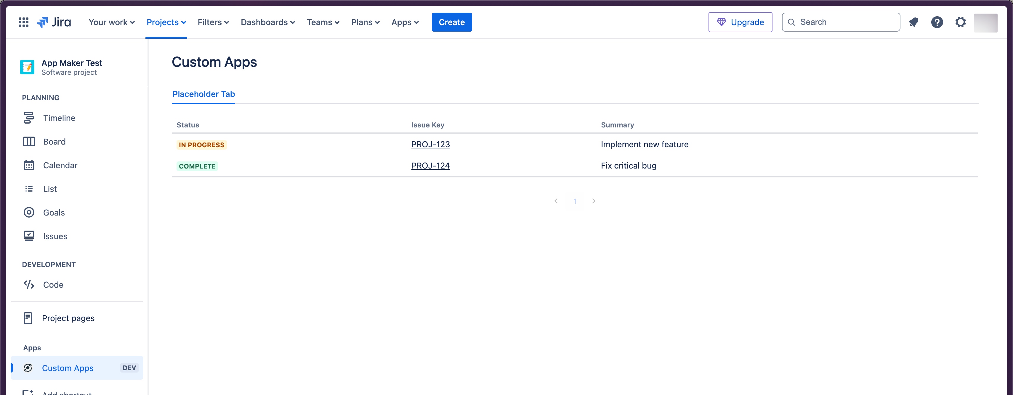
- This example would create a table with three columns:
Status(displayed as a lozenge)Issue Key(with a clickable link)- and
Summary.
- It would show two rows of data based on the provided
tableRows.
Sorting
- By default, all columns in a
DynamicTableare sortable. - Users can click on column headers to sort the table by that column.
- The sorting is handled automatically based on the data type of the column.
Customizing Cell Display
- The
fieldTypeproperty inTableHeaderallows you to customize how cell data is displayed. - Currently supported types are:
"text": Simple text display (default)"lozenge": Displays the value in aLozengecomponent
Conditional Styling
- The
appearanceMapproperty allows you to apply conditional styling to cells. - This is particularly useful when using the
"lozenge"field type. - You can map specific values to different appearances, allowing for visual categorization of data.
Best Practices
- Consistent Data Structure: Ensure that all objects in your
tableRowsarray have a consistent structure that matches yourcolumnHeadersdefinitions. - Use Meaningful Titles: Choose clear and concise titles for your columns that accurately describe the data they represent.
- Appropriate Field Types: Select the most appropriate
fieldTypefor each column. Use"lozenge"for status-like fields where color coding adds value.
Next Steps
- We mentioned the concept of Template Functions during this guide, but we haven't covered what they actually are.
- Next up, we'll cover how you can use Template Functions to implement pre-built logic provided by App Maker to add more advanced functionality in your apps.